Published 2021-04-13
一些有用的Html&&css&&javascript Tips

loading=lazy属性
这是一个性能优化的措施,图片懒加载
<img src="image.jpg" loading="lazy" alt="Alternative Text" />
Email、tel、sms
<a href="mailto:{email}?subject={subject}&body={content}"> Send us an email </a>

<a href="tel:{phone}"> Call us </a>

<a href="sms:{phone}?body={content}"> Send us a message </a>
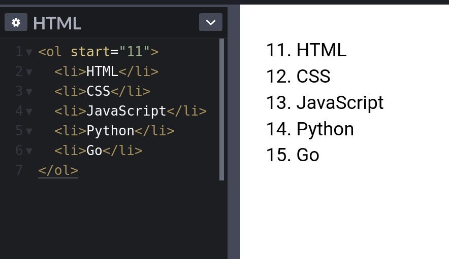
列表start属性
使用
start属性改变列表的初始序号
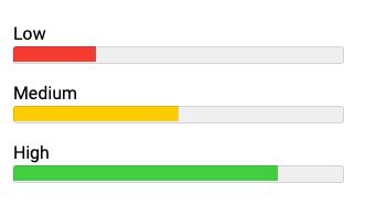
meter Element
无需 js、css 写出 progress bar
<label for="value1">Low</label>
<meter
  id="value1"
  min="0"
  max="100"
  low="30"
  high="75"
  optimum="80"
  value="25"
></meter>

<label for="value2">Medium</label>
<meter
  id="value2"
  min="0"
  max="100"
  low="30"
  high="75"
  optimum="80"
  value="50"
></meter>

<label for="value3">High</label>
<meter
  id="value3"
  min="0"
  max="100"
  low="30"
  high="75"
  optimum="80"
  value="80"
></meter>
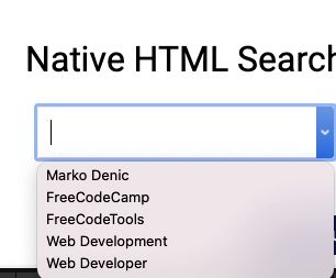
html 原生搜索
<div class="wrapper">
  <h1>Native HTML Search</h1>

  <input list="items" />

  <datalist id="items">
    <option value="Marko Denic"></option>
    <option value="FreeCodeCamp"></option>
    <option value="FreeCodeTools"></option>
    <option value="Web Development"></option>
    <option value="Web Developer"></option>
  </datalist>
</div>
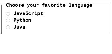
Fieldset Element
<form>
  <fieldset>
    <legend>Choose your favorite language</legend>

    <input type="radio" id="javascript" name="language" />
    <label for="javascript">JavaScript</label><br />

    <input type="radio" id="python" name="language" />
    <label for="python">Python</label><br />

    <input type="radio" id="java" name="language" />
    <label for="java">Java</label>
  </fieldset>
</form>
Window.opener
用
target = "_ blank"打开的页面允许新页面访问原始页面的window.opener。这可能具有安全性和性能影响。包括rel = "noopener"或者rel = "noreferer"`来防止这种情况。
<a href="https://markodenic.com/" target="_blank" rel="noopener">
  Marko's website
</a>
Base Element
如果需要在新标签打开所有的链接,使用
base
<head>
<base target="_blank" />
</head>
<!-- This link will open in a new tab. -->
<div class="wrapper">
This link will be opened in a new tab:
<a href="https://freecodetools.org/"> Free Code Tools </a>
<p>
Read more: <br /><a
href="https://developer.mozilla.org/en-US/docs/Web/HTML/Element/base"
>
MDN Documentation
</a>
</p>
</div>
去除 favicon 缓存
使用时间戳或者其他版本信息去除缓存,这样每次获取的 favicon 都是新的
<link rel="icon" href="/favicon.ico?v=2" />
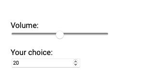
原生 sliders
<label for="volume">Volume: </label>
<input type="range" id="volume" name="volume" min="0" max="20" />

<label for="result">Your choice: </label>
<input type="number" id="result" name="result" />
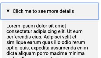
html Accordion
<div class="wrapper">
  <details>
    <summary>Click me to see more details</summary>

    <p>
      Lorem ipsum dolor sit amet consectetur adipisicing elit. Ut eum
      perferendis eius. Adipisci velit et similique earum quas illo odio rerum
      optio, quis, expedita assumenda enim dicta aliquam porro maxime minima sed
      a ullam, aspernatur corporis.
    </p>
  </details>
</div>
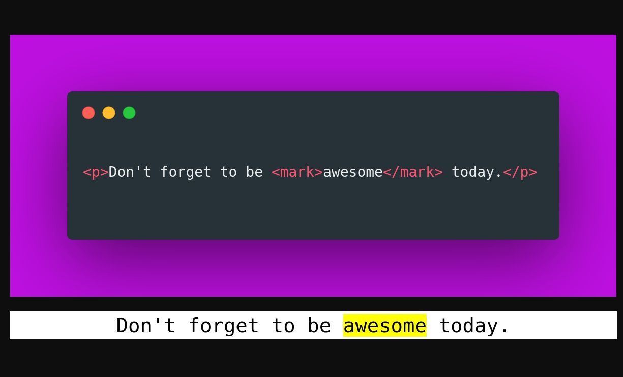
mark 标签
使用
mark标签高亮文字
download属性
<a href="path/to/file" download> Download </a>
picture 标签
<picture>
  <!-- load .webp image if supported -->
  <source srcset="logo.webp" type="image/webp" />

  <!--
	Fallback if `.webp` images or <picture> tag
	not supported by the browser.
  -->
  <img src="logo.png" alt="logo" />
</picture>

fancy text

<h1>CSS IS AWESOME</h1>

<style>
  h1 {
    background: blue url('https://picsum.photos/id/1015/200/300');
    background-clip: text;
    -webkit-background-clip: text;
    color: transparent;
    margin-top: 20px;
    font-size: 120px;
  }
</style>
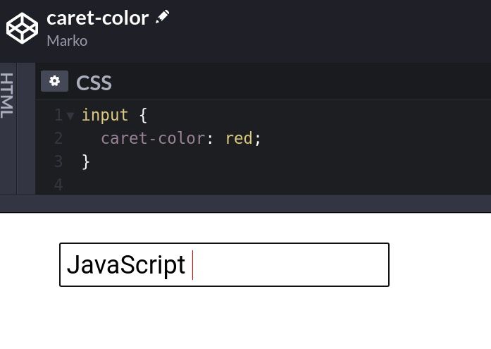
caret-color
改变光标颜色
CSS only tooltips
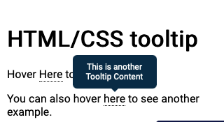
<h1>HTML/CSS tooltip</h1>

<p>
  Hover <span class="tooltip" data-tooltip="Tooltip Content">Here</span> to see
  the tooltip.
</p>

<p>
  You can also hover
  <span class="tooltip" data-tooltip="This is another Tooltip Content"
    >here</span
  >
  to see another example.
</p>

<style>
  .tooltip {
    position: relative;
    border-bottom: 1px dotted black;
  }

  /* Tooltip box */
  .tooltip:before {
    content: attr(data-tooltip);
    position: absolute;
    width: 100px;
    background-color: #062b45;
    color: #fff;
    text-align: center;
    padding: 10px;
    line-height: 1.2;
    border-radius: 6px;
    z-index: 1;
    opacity: 0;
    transition: opacity 0.6s;
    bottom: 125%;
    left: 50%;
    margin-left: -60px;
    font-size: 0.75em;
  }

  /* Tooltip arrow */
  .tooltip:after {
    content: '';
    position: absolute;
    bottom: 75%;
    left: 50%;
    margin-left: -5px;
    border-width: 5px;
    border-style: solid;
    opacity: 0;
    transition: opacity 0.6s;
    border-color: #062b45 transparent transparent transparent;
  }

  .tooltip:hover:before,
  .tooltip:hover:after {
    opacity: 1;
  }
</style>
Comments
No Comments!